
For my personal brand, I wanted it to represent a lot of things that have meant a lot to me for a very long time. I feel that relationships and getting to know a person are essential, so this was a small simple way to show a little bit about who I am and what I like.
For as long as I can remember blue has always been my favourite colour, especially cyan. Blue is usually associated with sadness, but it always makes me happy. I love being outside as well, so blue reminds me of a sunny sky and clear water. Black, white and grey are neutral colours that compliment the colour blue, so I chose them as my secondary colours.
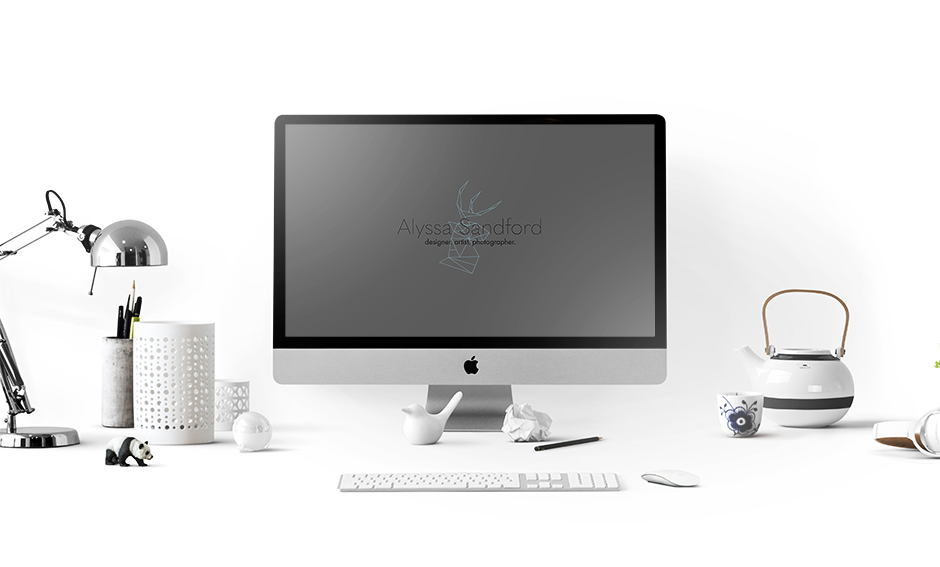
I love minimalism and sleek geographic looks, although my room is far from it due to my love of collecting things. I wanted my logo to be clean and modern to stay with the current design trend, so I used a thin, sans-serif font and a stag head made of lines. Within the lines, I placed my initials which are highlighted. These highlights are removed if they become too distracting if my logo is underneath some text, for example.
The stag head comes from my love of animals. I have always been around animals, whether it was a pet or wildlife from the forest near my house. I used to volunteer at a place where they took in exotic and farm animals that were usually sick, injured, or abandoned, and used them as therapy animals for children with special needs. While I was working there, we recieved a very young deer named "Jane Doe (aka JD)" who's mother had been killed. Luckily she was rescued and brought to us. I liked deers, but after meeting JD I now adore them. She was the sweetest little thing and would always give you kisses when you were in her enclosure. Animals have always been a huge part of my life, and will always have a special place in my heart.